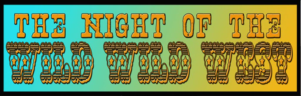

Post by zimmerman on Aug 4, 2020 15:21:40 GMT -5
This thread has not been getting as much attention on the other board, so I am reposting it here for the other members. Considering the fact that our Admin is an artist of note, he might have some unique opinions on this topic.
I always liked the end of scene freeze-frames, but I never really paid that much attention to the art and detail that CCB describes here. I will need to take the time and look at all of them before I make any opinions on them:
Topic author: ccb
Subject: Crummy Freeze-Frames
Posted on: 07/24/2020 13:01:41
Message:
As all visiting this site know, one of West's signature elements of production design were its eight-second freeze-frame bumpers into each act's commercials. As a kid, those just tickled me. They still do.
My favorites were always from Season One: the daguerreotype style that suggested illustrations of the late nineteenth century. Those died when the show went to color in '66. When Michael Garrison was alive to produce, he shifted to the four-color blocks, which were neat, I think, but unevenly produced. By the time they worked out the glitches so that the images were nearly perfect (I'd say "The Night of the Ready-Made Corpse"), Garrison had died, the reins were handed over to Bruce Lansbury and he opted for the cartoons. I never liked those. At the beginning of the the third and fourth seasons I watched the premiere episodes, eagerly hoping they had reverted to something classier. Because Lansbury was still running the show and I was too naîve to realize that he was making such decisions, I was always disappointed.
Now to the real subject of this thread: crummy freeze-frame bumpers. Why makes a crummy bumper for me?
1. The frozen image is off-center for the "block" it occupies in the Mondrian tableau. That's the biggest offense: you care hardly see the image at all. This was probably because the episode's director filmed only one take of the closing scene and it's all the film editor had to work with.
2. The cartoon (most of Season Two through the rest of the series) is so poorly rendered that it's practically a smudge on the screen. There's no artistry at all. A sixth-grader could have drawn and colored something just as good.
3. A variation on #2: the image is lopsided or otherwise ugly.
4. Telegraphing the freeze by zooming in on the image that will be frozen. This became a cliché. Its worst practitioner was Irving Moore, who directed more episodes than anybody. A zoom-in is the camera's equivalent of an exclamation point. Used sparingly, it could be effective but it was overused. Personally I preferred the freezes when I didn't expect them.
5. Some other quirk that deviated from the established pattern: the timing of the music was off, so that it ended before the image faded to black, or the series' title didn't fade in when it should have or the an insert is discontinuous with the action muffs the image.
Now: Some examples of what I think are crummy freeze-frames. Feel free to add your own, if you have nothing else to do while under quarantine or in isolation. In a separate thread we can give equal time to the best bumpers.
Example #1: The Off-Center Image: Two immediately come to my mind. (1) "The Feathered Fury," end of Act II: the magical pistol from the chafing dish wasn't centered, so you can barely see what's been frozen. (2) "The Turncoat" (Act 1): After West has given Artie a roundhouse punch and exits past the open door, Conrad swung so far to camera left that, after the pull-back, there's almost no image in the lower-left rectangle at all.
Example #2: The Sixth-Grader's Cartoon: For this I'd nominate the end of Act I of "The Night of the Assassin" (West and Lupito in a diversionary, romantic clinch). The image is simply awful. There's no other way to describe it.
Example #3: Lopsided or ugly image: My nomination for this category is end-of-Act II for "The Sabatini Death." The image was was not a bad one to freeze: West's reaction to the photograph of mother and child. The problem: the director used a lens that cuts off everything but the actor's eyes and, by that point in the series, bad hairstyle. What the director should have done (say I): freeze that frame for the bottom right rectangle; pull the camera back for the end of the episode's tag, and freeze Conrad's smiling face as a smaller image to occupy the upper-left block.
Example #4: The Wow-It's-Time-for-a-Commercial! Too many to mention, and Moore's favorite cliché. One example: end of Act II, "Montezuma's Hordes."
Example #5: the blundered deviation: Three standouts: "The Tycoons," end of Act III; somebody forgot to tell the postproduction editor that you don't brand the series name until after the camera has pulled back for the full tableau. In that case the title dissolves over the the frozen image (mannequins that have come to life) before the camera pulls back. The other standout: End of Act III, "The Cut-Throats" (Jim's eying the town's platoon of marauders). Here the music editor goofed: he overdubbed Richard Shores's musical stinger four seconds before the freeze, the camera pulls back, and we watch the tableau in four seconds of silence. (Picky, picky, picky: but these guys were professionals.) A clumsy insert for the freeze-frame: end of Act II, "The Arrow." The handcuffed West works well, the image balance is fine—but the Conrad (or is his stand-in) is wearing a satin vest underneath his blue corduroy bolero jacket. Except for other clumsy inserts, the wardrobe master never dressed him that way. In context, the vest has magically appeared after West has dismounted to be apprehended by General Baldwin's subordinates.
Okay. I have all that off my chest. Any crummy bumpers any of you want to add to my nominations?
Replies:
Reply author: SordoTheBandit
Replied on: 07/26/2020 09:01:39
Message:
Excellent post!
Here is one example from me:
'The Night of the Inferno' (Season One) (an excellent episode by the way)
Lydia Monteran (Suzanne Pleshette) firing that gun, then she twirls it, then freeze-frame. The freeze-frame drawing of her is just awful, 6th grade art class. It is the second freeze-frame on the episode.
Reply author: bornin62
Replied on: 07/29/2020 07:22:50
Message:
Not crummy, but...
ccb, did they ever have an episode that did not feature RC in at least one of the boxes?
And, did Michael Dunn appear in at least one box in every episode he was in?